

Aptos Font has quietly become one of the most widely used typefaces in the world since Microsoft made it the new default across its Office suite in 2023–2024. Designed by renowned typographer Steve Matteson, this clean, contemporary neo-grotesque sans-serif brings a fresh, professional edge to documents, presentations, spreadsheets, and emails used by hundreds of millions of people daily. Whether you are a student drafting essays, a professional creating reports, or a designer seeking versatile typography, Aptos Font offers exceptional readability, modern aesthetics, and remarkable adaptability across different contexts and screen sizes.
This comprehensive guide explores everything about Aptos Font — its fascinating origins, technical characteristics, comparison with Calibri, practical applications, installation methods, design philosophy, and why it represents a significant evolution in everyday digital typography. Far more than just another system font, Aptos embodies Microsoft’s commitment to clarity, versatility, and user-centered design in an increasingly visual and screen-first world.
The Story Behind Aptos: From Bierstadt to Global Default
The journey of Aptos Font began years before its official rollout. Microsoft recognized that Calibri, its default since 2007, had served its purpose well but needed refreshing for modern display technologies, higher-resolution screens, and evolving design expectations. In a rare open process, Microsoft commissioned five leading type designers to create candidate fonts for the next Office default.
Steve Matteson, the designer behind classics like Segoe and several Windows core fonts, submitted a typeface originally named Bierstadt (inspired by a Colorado mountain). After extensive user testing and feedback across Word, PowerPoint, and Outlook, Bierstadt emerged as the favorite. Matteson later renamed it Aptos after his favorite unincorporated town in Santa Cruz, California. The diverse landscape of Aptos — with its fog, beaches, redwood forests, and mountains — perfectly symbolized the font’s versatility and balanced character.
Aptos officially began rolling out as the default font in Microsoft 365 in 2023 and 2024. This change affected hundreds of millions of users worldwide, marking one of the most significant typography shifts in computing history. Unlike previous defaults that evolved organically, Aptos resulted from deliberate research, user testing, and thoughtful design iteration.
Design Philosophy and Technical Characteristics
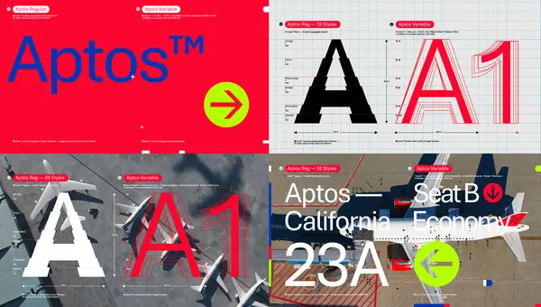
Aptos Font draws inspiration from mid-20th-century Swiss typography while incorporating subtle humanist elements. Its precise, clear-cut stroke endings emphasize order and restraint, making it highly legible in both print and digital environments. The font family includes multiple weights and styles: Light, Regular, Semibold, Bold, Black, and their italic counterparts, plus specialized variants like Aptos Display, Aptos Narrow, Aptos Mono, Aptos Serif, and Aptos Slab.
Key design features include:
- A slightly condensed proportion that fits more text comfortably on screens
- Distinctive lowercase “l” with a subtle curve to differentiate it from capital “I” and the numeral “1”
- Balanced x-height for excellent readability at small sizes
- Clean, geometric influences with humanist warmth in select letterforms
- Strong performance across different languages and scripts
These characteristics make Aptos particularly effective for long-form reading, data-heavy spreadsheets, and professional presentations. Its versatility allows it to function seamlessly as both a body text and display font, reducing the need for multiple typefaces in a single document.
Aptos vs Calibri: A Detailed Comparison
Many users initially notice subtle rather than dramatic differences when switching from Calibri to Aptos. However, side-by-side comparisons reveal meaningful improvements in modern contexts.
Aptos appears slightly more compact yet maintains excellent spacing. Its stroke terminals are flatter and cleaner compared to Calibri’s softer, rounded endings, giving documents a sharper, more contemporary feel. The lowercase “a” in Aptos uses a double-story form with refined proportions, while the overall texture feels more even and professional on high-resolution displays.
Calibri remains warm and approachable, which many still prefer for certain creative or informal documents. Aptos, however, projects quiet confidence and modernity — qualities increasingly valued in professional communications. In Excel particularly, Aptos Narrow helps fit more data without sacrificing legibility.
Users report that Aptos reduces eye strain during extended screen time, thanks to its optimized spacing and clearer character distinction. This improvement in on-screen performance represents one of Microsoft’s primary motivations for the change.
Practical Applications and Best Uses for Aptos Font
Aptos Font excels in numerous professional and personal contexts. In corporate environments, its clean professionalism makes it ideal for reports, proposals, and internal communications. Educators appreciate its clarity for lesson plans and student materials, while designers leverage its versatility for branding and marketing collateral.
For web and digital content, Aptos performs exceptionally well on websites, emails, and social media graphics. Its web-optimized variants ensure consistent rendering across different browsers and devices. Creative professionals often pair Aptos with complementary serif fonts for elegant contrast in editorial design or annual reports.
The font family’s range of weights supports sophisticated typographic hierarchy. Light and Semibold weights create subtle emphasis, while Bold and Black variants command attention in headlines. This flexibility reduces the need for multiple font families, streamlining design workflows and maintaining visual consistency.
How to Install and Use Aptos Font Everywhere
Microsoft 365 subscribers automatically receive Aptos through cloud font services. For users wanting the font in non-Office applications or older software, Microsoft provides an official download package.
Installation is straightforward on Windows and macOS. After downloading the zip file from Microsoft’s website, extract the fonts and install them through your operating system’s font manager. Once installed, Aptos appears in all applications supporting system fonts, including Adobe Creative Suite, Google Docs (via upload), and design software.
For web developers, Aptos can be implemented through CSS font stacks or by hosting the font files with proper licensing. Organizations can deploy it enterprise-wide through group policies or device management tools to maintain consistent branding.
Power users often create custom themes in Word, Excel, and PowerPoint that set Aptos as the default, ensuring new documents automatically use the modern typeface.
The Future of Typography and Aptos’ Role
Aptos represents a broader shift in digital typography toward fonts optimized for screens rather than print-first design. As remote work, digital collaboration, and high-resolution displays become standard, typefaces like Aptos will play an increasingly important role in effective communication.
Microsoft continues refining Aptos based on user feedback, with potential updates focusing on expanded language support, variable font technology, and enhanced accessibility features. The font family’s success may influence other technology companies to reconsider their default type choices with similar attention to modern usage patterns.
For individual users and organizations, adopting Aptos signals alignment with contemporary design standards while maintaining the reliability expected from Microsoft products. Its thoughtful design ensures it will remain relevant for years to come, much like Calibri did in its era.
Community Reception and Expert Opinions
Reactions to Aptos have been largely positive among design professionals who appreciate its contemporary feel and technical excellence. Some traditionalists initially resisted the change from the familiar Calibri, but most have adapted quickly upon experiencing its improved screen performance.
Typography experts praise Matteson’s achievement in creating a font that feels both fresh and timeless. Its success demonstrates the value of user-centered design processes that incorporate real-world testing rather than purely theoretical decisions.
In educational and corporate settings, Aptos has helped modernize document aesthetics without requiring extensive retraining or redesign efforts. Its neutral yet distinctive character makes it appropriate for diverse contexts while projecting competence and clarity.
Conclusion
Aptos Font marks a significant milestone in digital typography as Microsoft’s thoughtful successor to the long-serving Calibri. Designed with precision, versatility, and modern screen usage in mind, it delivers exceptional readability, professional aesthetics, and remarkable adaptability across countless applications and contexts. From its origins as Bierstadt through extensive user testing to its current status as a global default, Aptos embodies the evolution of everyday communication tools in our increasingly digital world. Whether you are drafting important business documents, creating engaging presentations, or simply seeking a cleaner, more contemporary typeface for personal projects, Aptos offers a refined solution that balances tradition with innovation. As typography continues evolving to meet new technological and aesthetic demands, Aptos stands as a benchmark for thoughtful, user-focused design that enhances rather than distracts from the message. Embracing Aptos means participating in the ongoing refinement of how we present ideas in the digital age — with clarity, confidence, and timeless professionalism.
FAQ
What is Aptos Font?
Aptos is Microsoft’s modern sans-serif typeface designed by Steve Matteson. It replaced Calibri as the default font in Microsoft Office applications in 2023–2024.
Why did Microsoft change from Calibri to Aptos?
Microsoft wanted a more contemporary font optimized for modern high-resolution screens, better readability, and evolving design standards after nearly 20 years with Calibri.
Who designed the Aptos Font?
Steve Matteson, a renowned type designer known for creating Segoe and other Microsoft fonts, designed Aptos (originally called Bierstadt).
How do I install Aptos Font?
Microsoft offers an official free download. Extract the zip file and install the fonts through your operating system’s font manager for use in any application.
Is Aptos Font better than Calibri?
Aptos offers improved screen readability, cleaner lines, and a more modern appearance, though preferences vary. Many find it sharper and more professional for contemporary documents.
Read More: